The influence of psychology on web design

Psychology and web design
Two terms that you don't often see mentioned in the same breath. Yet, there is an important link between the two that should not be underestimated. A good website is much more than just a "beautiful" online business card. It's about creating an effective and engaging online experience that appeals to visitors and encourages them to take action, whether that's purchasing your product or service immediately or not. And that's where psychology comes in.
Psychology is about understanding human behavior, thoughts, and emotions. When applied to web design, you take a more specific look at people's online behavior, which often (but certainly not exclusively) stems from their behavior outside the online world. By gathering this knowledge about your (potential) website visitors, you can adapt your website to it and thus improve their user experience (also known as 'UX' - User Experience). Designing digital experiences that take psychology into account is called UX design.
There are several ways to apply psychology to web design. Here are a few that we at Mannen van 80 frequently use.
Familiarity & Structure
Everyone has a certain image of a website in mind. You expect to see certain things and know how they work. For example, think of the navigation bar at the top of the screen, buttons, or a footer with contact details. And that expectation is not surprising; it is a fact that people have an innate preference for things they recognize. This makes us feel familiar and - if we take it all the way back to our nature - safe. In good web design, this also gives the visitor a sense of control, meaning that they don't have to focus on the basic 'operation' of the website, but on the actual content of it.
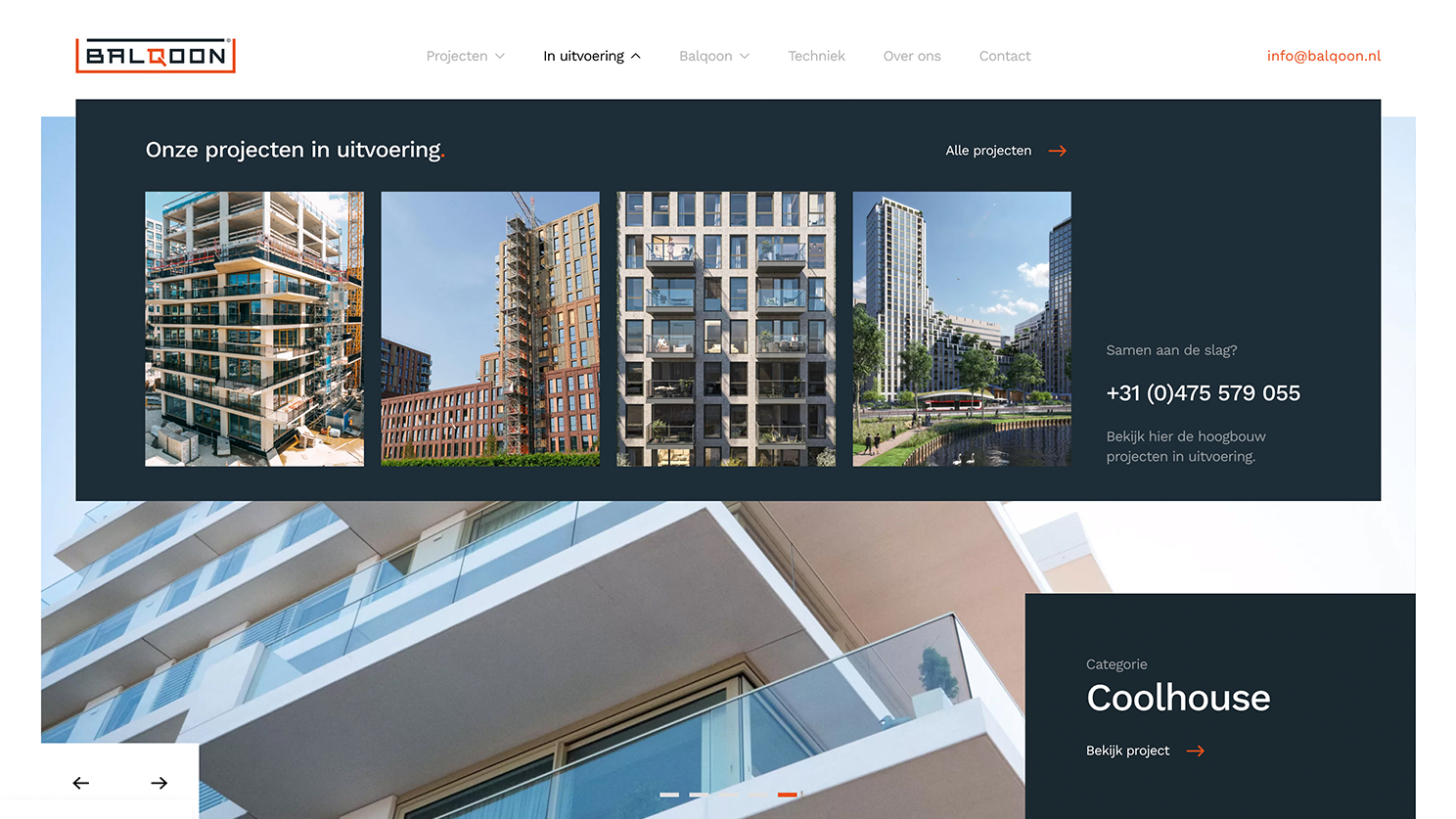
So, you can stand out with a unique and innovative web design, but if your visitors first have to wonder how the website works, it will soon surpass its aim. At Mannen van 80, we therefore always start from these conventions when designing a website. This was also the case with the Balqoon website, where we applied a clear navigation bar to divide the many pages into clear sections.

Social Proof
No matter how much we think we are independent and make our own decisions, the truth is slightly different. Whether or not we are aware of it, we are inclined to make decisions based on what others do. In web design, you can respond to this by, for example, showing reviews and case studies. If others choose something, they will have their reasons doing so, and thus, your trust in the product and/or service and company grows. That trust only increases further if these 'others' are people or organizations you look up to.
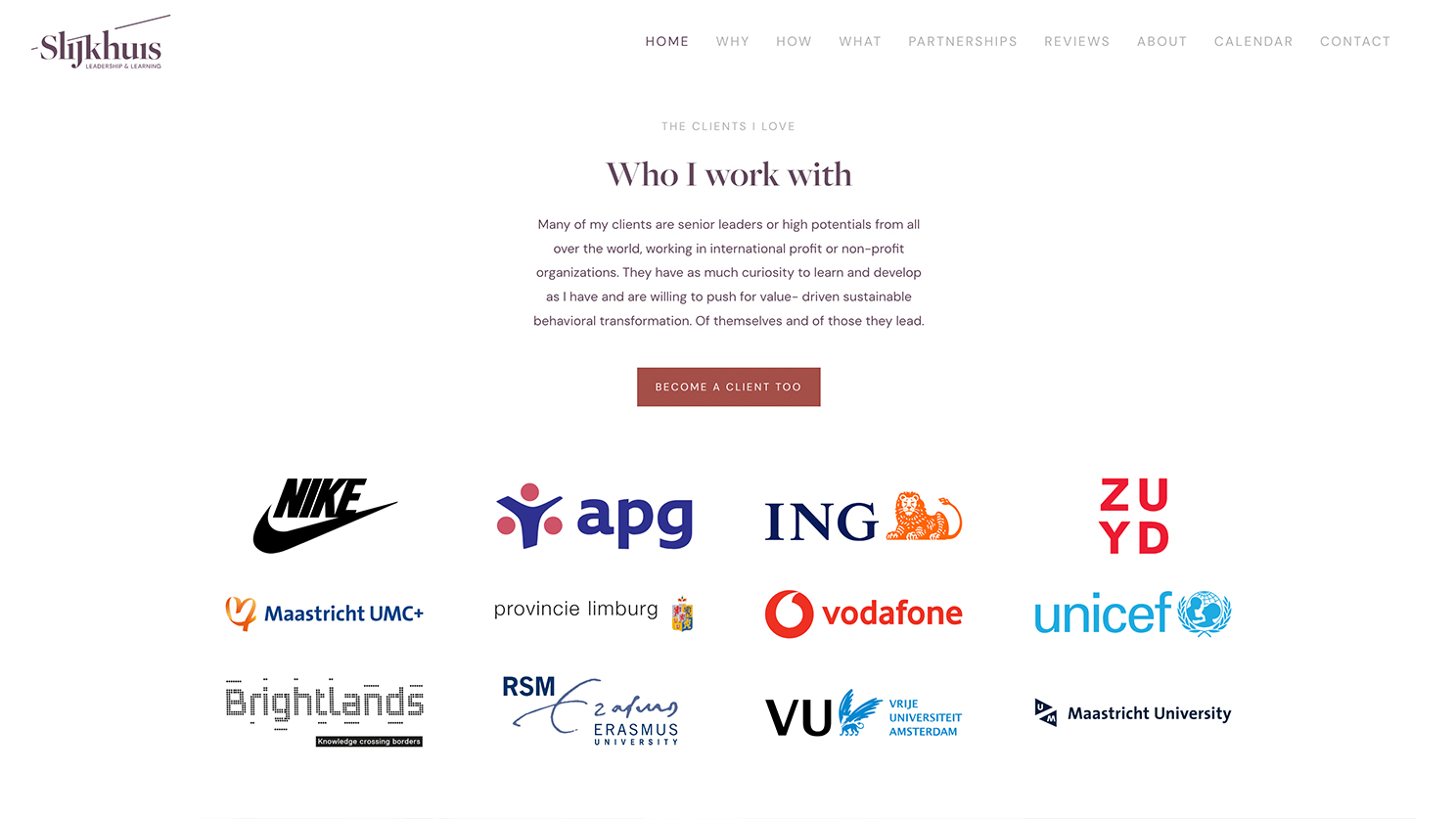
Social proof also plays an important role in the website we made for Jessica Slijkhuis. The strong reviews from people with high-level positions in their organization and the display of renowned large clients such as Nike, Unicef, University Maastricht, and Vodafone make a significant contribution to choosing Jessica.

Color & White Space
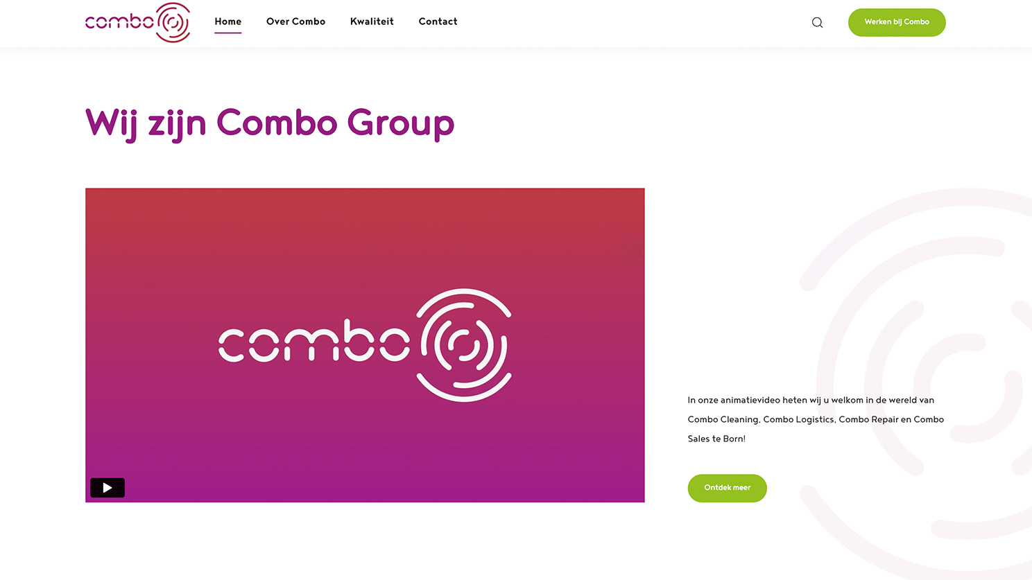
Whether or not consciously, colors evoke emotions and can therefore influence user behavior. For example, think of the color red, which evokes urgency and encourages action. On the other hand, white space provides peace and quiet. This peace and quiet is not an unnecessary luxury in web design, because you want visitors to focus on the most important content without being distracted. By combining color use with white space, you can guide the visitor to specific content. For example, think of an eye-catching button under a piece of text. By giving this button a striking color, different from the rest of the color, it attracts attention and encourages action. In the visual identities and websites we design, we therefore always define such a striking color, also called a conversion color, to add to the color palette.
With the Combo Group website, you can clearly see this interplay of white space and color use, aiming the focus on content and conversion.

Conclusion
Psychological principles in web design can be a powerful tool to strengthen your website and brand and attract potential customers. At Mannen van 80 we combine this knowledge with creative expertise to create websites that not only look good, but are functional and effective as well.
Curious how we can help you further? Contact us today.

Interesting?
Also read our other blogs